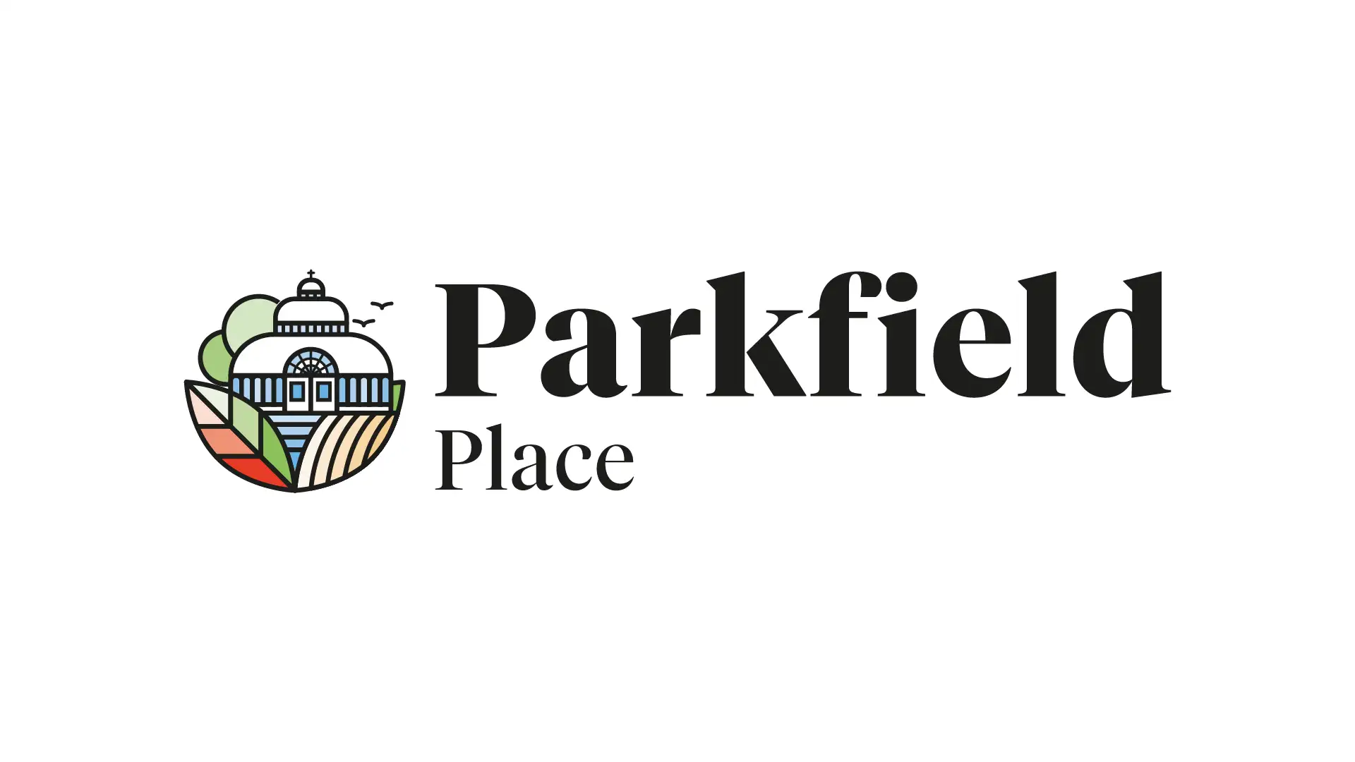
Working alongside Redwing on the Parkfield Place development was a delightful and creatively fulfilling experience. Drawing inspiration from the iconic Palm House in Sefton Park, Liverpool—a true symbol of beauty and tranquillity—I aimed to encapsulate its essence in the visual identity of the project. The result was a logo that embodies elegance and serenity, mirroring the architectural grace of the Palm House. Here’s a glimpse into the vibrant branding materials I crafted:
Logo: The logo reflects the structural elegance and transparency of the Palm House, using geometric shapes and a serene colour palette that invites potential homeowners to envision a peaceful life at Parkfield Place.
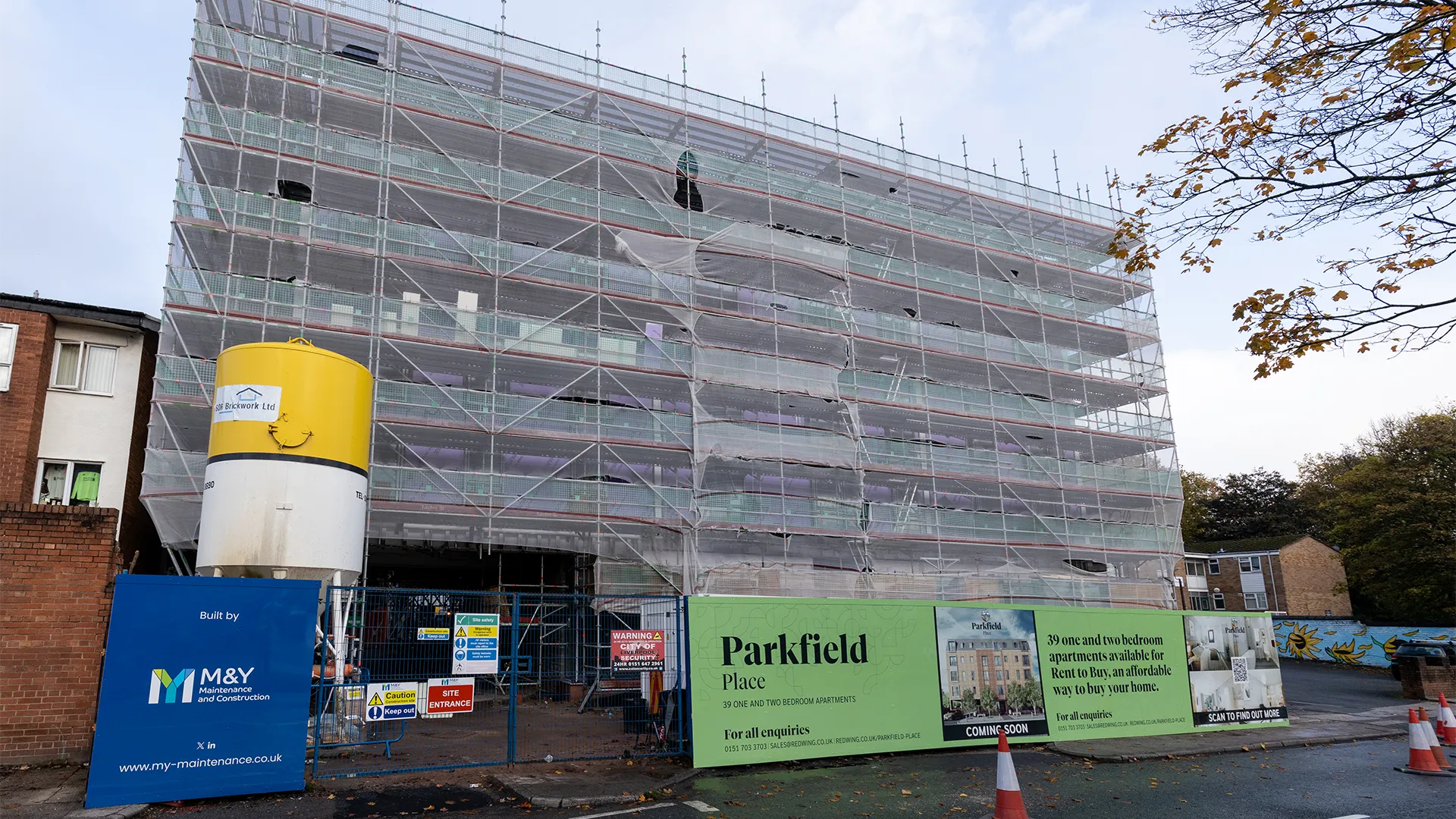
Construction Hoarding: To engage the community and passersby, the hoarding was designed with captivating visuals of the development and the Palm House, fostering a connection between the site and its local heritage.
Brand Guidelines: Comprehensive guidelines were developed to ensure consistent application across all marketing materials, reinforcing the brand’s message and aesthetic appeal.
These elements played a pivotal role in marketing the 39 chic two-bedroom apartments, making them not just structures, but a lifestyle choice synonymous with beauty and tranquility.


